Thursday 28 February 2013
The building blocks towards making my trailer
Here is the first 30 seconds of what I had edited within a week. It's not very good, but you can see the development of my trailer and how I made it in bits. I intend to use this as a mini trailer for my website so I'm making use of this.
Production Plan and Time management
This was posted late due to me being busy with editing the actual trailer.
Filming day 1 12th February; started filming at 12pm finished at 5pm
Medium shot of Alx opening the box
Over the shoulder shot of Alx opening the box
Alx's voiceover recorded
Close-ups of the pencil, writing paper and bracelet
Over the shouldershot of Alx opening the paper to reveal the creepy message
The medium close-up of Alx picking up the phone worringly
Alx holding a knife with the tip on her finger it shows a close up of the knife
Medium close-up of Alx of her scribbling on the paper
Two-shot of Alx and Danny sat at the table in medium close-up
Two-shot of Alx going to supposedly stab Danny's hand
Medium close-up Alx is sat on the bed scribbling
Medium close-up of Danny asking if Alx is ok
Medium close-up of Alx stating "For whom the bell tolls"
Medium close-up of Danny accompanied by the voice over of Alx "It tolls for thee"
Medium close-up of Alx scribbling on the paper
Low angle shot of Alx holding the knife
Extreme close-up of Danny on the floor
Extreme close-up of Alx's eye
Filming day 2 February 17; 1pm - 1:30pm
I recorded the voice over of Danny explaining what the box is as Ryan was unable to attend. I have improvised due to lack of time and not being able to book out a camera again.
Update; I decided not to use Danny's voice over as I felt that it gave too much of the narrative away and would therefore spoil the story for the target audience.
Time management;
Both filming days were a success as I thought it would take a lot more time in filming day 1 due to moving the LED lighting systems around the house for the individual shots. I am on time with my overall project as I have filmed everything I needed during February half term. I have completed my film poster, it is subject to a little bit of change but nothing major. I spent two days after half term after college on the first week back which consisted of a hour one day and a hour and a half. This consisted of organising, naming clips and a fair bit of editing. As a result I managed to produce a 30 second draft. After spending another week of editing after college hours I managed to get 1 minute and 30 seconds edited. I am contemplating on using this draft as a sneak peak mini trailer for my website.
Update; By the 7th of March I produced a second draft. So it took me 18 days editing as we came back on the 18th of February after half term. I did not immediately upload the drafts on my blog as I just wanted to continuously produce drafts of my trailer so I had a lot of footage on my blog. By the 14th, I uploaded my second draft and uploaded a third and fourth draft on the 15th of March (they were uploaded at the same time because I forgot to upload due to working on ancillary texts.) I was concious that the deadline for my main products was the 22th of March.
Sunday 24 February 2013
Hand drawn drafts of ancillary texts (initial ideas)

I decided to make a film soundtrack cover as well for my project. I know this isn't a part of my ancillary texts, but I thought I would do that little bit more. Most films offer a soundtrack for the audience to download. I would offer this as more of a incentive to go see the film and visit my website. I offer this as my target audience may really enjoy this sound track and will want to download it. If they really enjoy it, they will recommend it to their friends which increases the growth of my film via web 2.0.

Before starting designing my poster, I did a hand drawn sketch of how I initially wanted my poster to look like. Which was Alx in the centre and then edited to a effect where she looks really demonic. So the genre is clear to the target audience. It's not a really good drawing and it doesn't give exact director and production details. But it gave me a idea of where to place these when designing it in Photoshop.
Monday 18 February 2013
Interviews with my cast about how they feel being in the film
I decided to film these interviews as a fun element to my project. It's also audience feedback in essence.
Sunday 17 February 2013
Final film poster

Here is the final draft of my horror poster. In my hand sketched initial ideas, I decided to use Alx edited to a effect where it reflects the horror genre. I then re-thought about my inital ideas and used a doll's house. I wanted to use a image that wouldn't over power the blood effect and cover most of the wall paper. The doll house is relevant as it's a key item in the trailer as well as the box. I thought about using a image of the box, but I wanted to use a fairly bigger image. The doll house is connected to the narrative as the girl used to play with it a lot. Here I added the 15 age certificate symbol and imported the house into the poster de-saturated with a drop shadow effect. I decided to use a teddy bear with a knife as props like these denotate the genre greatly. Children's toys like this are used in the Silent Hill film and game franchise. Silent Hill is one of my inspirations for the project. The teddy bear's head is also slanted in a demented like way. This kind of effect is inspired by The Exorcist and is completely juxtaposed to the objective of a teddy bear which is to be cute. I also de-saturated it as was too bright and took too much attention away from the main image. To keep a consistent main house style like in my AS coursework, I feature my psuedo production company logo on my poster too. This will be in my film trailer and website too. So that the audience can recognise it in all products.
Images for poster and explanation why I have chosen the particular item

This is the main image I will be using (above) I couldn't really decide what to use for my film poster. The inspiration came from my niece owning this doll's house. Girls particularly at the age of 5 up until 12 stereotypically play with this kind of thing. The dead girl who is the antagonist is age 10. I therefore though it was appropriate to use this. This kind of item is conventionally found in Horror films featuring children as it adds denotes more of a psychological feeling which reinforces the genre I am communicating to my target audience. The only problem is that this doll's house is pink which doesn't reflect the genre. So in editing, I will de-saturate the colour so that it matches the colours of my poster.

I took some test photographs at first and they weren't successful, the lighting wasn't particularly good and the doll's house looks out of place, like it's on a slant.

Friday 15 February 2013
Revised storyboard
This is a completely revised storyboard. I have not filled in the shot description as I have given them in earlier storyboards. This is the first sheet. There have been some set backs of scanning in the sheets, the drawing quality has been reduced so you can hardly see the drawings.

Page 2

Page 3

Page 4

Page 5

Page 6

Page 7

Page 8

Page 9

Page 10

Page 11
Wednesday 6 February 2013
Examples of film posters which have inspired me
For reference, these are the posters which I have looked at that inspired me in terms of mise-en-scene. I have mainly taken influences from Sinister as it has a psychological horror narrative and I am creating a similar thing. As you can see the poster has a grunge, concrete like texture where the wall paper is torn with blood smeered across the wall.

Another poster I have taken inspiration from is The Last Exorcism. It has a similar colour scheme except it's a lot more whiter which is not what I was going for. But the typography was some form of inspiration. A reoccuring feature is that the victim/antagonist is a girl as the main image which is what I will do/have done with my poster.

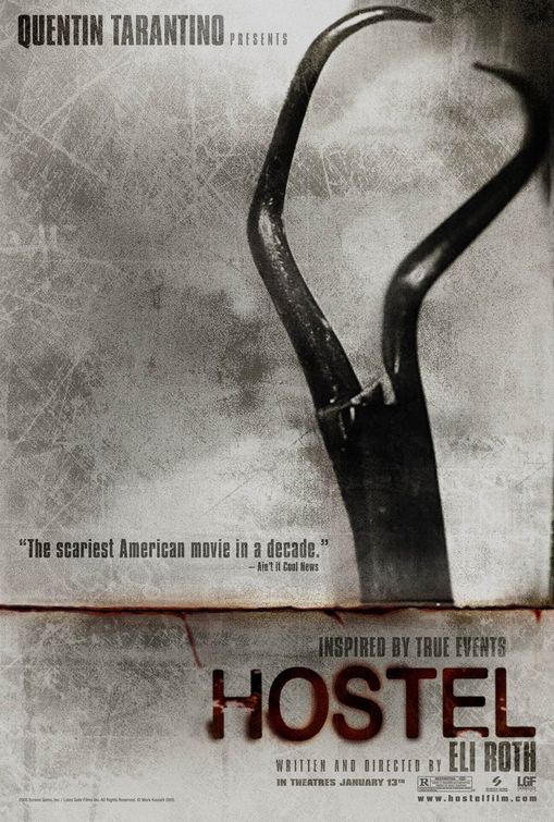
I have taken colour scheme influences from the Hostel poster too. As you can see it has quite a metallic feel to it and there are shades of white which connotates a psychological/gore feel.
Tuesday 5 February 2013
Production Plan 2
I decided to map out what I need to amend my shots to make the film trailer a better quality. I wrote what I basically needed out on paper and scanned this in.
During February half-term I aim to achieve finishing my filming in one whole go so that when I get back, I can edit straight away. I have had a few set backs as the location (Danny's house) could not be used 2 weeks ago (going back to January) I was really hoping to finish it then but due to unfortunate circumstances, I couldn't. In addition, there wasn't any cameras to lend out.
To finish my film poster off, I need to take the main image. But because Alx is in New York at the time I wrote this, I could not. I was hoping to get the image before half term so that I could complete my poster. Because there wasn't any cameras at the time in January, this was not achievable.
The following date of which half term starts is the 9th February to 18 February. I aim to film on the 12th of Febuary (Tuesday), this is when Alx gets back from New York and it has been said by Danny that his house will be available. This day is subject to change, but it will get done during the course of half term.

Monday 4 February 2013
Application of theory to planning - Narrative
I decided to make power point slides about narrative theory which are present within my trailer.

The 'onset phase' is applicable to my narrative at the beginning of my trailer where (when it is edited and re-shooted, just thinking ahead) the voice over introduces the engima.

Propp's seven roles which are in my trailer are the villain, hero and the helper. Although not all of them are present in my trailer, Propp argues that these roles even if few are present in most narratives.


Todorov's theory is pretty much similar to Carroll's theory. The reason why I have looked at two same theories is that I wanted to be concise.

Strauss's theory is applied in my trailer in relation to Danny and Alx's costume (mise-en-scene) Danny where's a white shirt which signifies and denotates the protagonist as opposed to Alx who wears a black t-shirt with white stripes to symbolise the antagonist.
Subscribe to:
Posts (Atom)