Tuesday, 9 April 2013
Evaluation
Question 1; In what ways does your media product use, develop or challenge forms and conventions of real media products?
I have created my teaser trailer ‘The Host’ which is psychological horror (sub genre) based on the forms and conventions of existing media products. Before producing my film trailer I researched and studied a variety of trailers in different genres (Analysis of trailers) (Trailers I have looked at). I then decided to look into specific conventions of the psychological horror genre conventions and then stated the familiar conventions. (Conventions of psychological horror film trailers) ( Conventions of the horror genre in general) I then finally decided to look at the history of film trailers to add a bit of depth to my research.
For question 2, I have provided goanimate videos to discuss the codes and conventions I have found for my ancillary products.
Codes and conventions of websites by Dan.T on GoAnimate
Animated Presentations - Powered by GoAnimate.
Conventions of a film horror poster by Dan.T on GoAnimate

Sunday, 31 March 2013
Audience Feedback 2

I again conducted another questionnaire. I asked the same equal amount of female and males (which was 3 each) and asked 6 in total. It was important to have a equal number of both of the gender as this represents that the female gender is gaining more equality in horror films as they tend to be the antagonist which over powers the male.

My target audience is 15-26 therefore so I asked people within this age bracket. There is two people that answered they're in the 30+ age bracket so it gives my media texts a wider target audience than originally expected.
After watching my film trailer, does the narrative make sense to you?
I was fairly okay with the answers I collected from this. Some of the people could not identify the narrative and found that it did not make sense at all. They could not identify the true antagonist. Some said it was conveyed very well, that it was professional and that there were some good elements of psychological horror.

80% enjoyed watching my video which was a great overall positive bearing in mind that I had no professional actors or a good budget. 20% did not enjoy due to it not reflecting the horror genre all that well, expectations were not that great and wanted more (particularly the first half of the trailer).
What would you change about my film trailer?
This question was integral to my evaluation as I could reflect on what I could have done to improve as my target audience did not enjoy some aspects. It was a mixture of positive and negatives. Some said that the dialogue and soundtrack would need to be improved. Specifically, the dialogue can't be heard in the scene where Ryan speaks directly to Danny. The soundtrack towards the end could be improved by making it more high pitched so it creates more tension. Some shots were repetitive. I understand that some shots are repetitive but I did not want to disclose much of the plot. If I revealed too much then it would spoil the film completely.

60% of the people asked said that they would go to see my film trailer. 40% said no. It's almost a 50/50 split which is quite pleasing. I can understand why 40% said no though due to the repetitive scenes, audio was not good in certain places and nonsensical plot.

90% said that they enjoyed my film poster which I was extremely pleased about. I put a lot of effort into making it. Most people praised the use of background colour, the mixture of white, grey, brown and the use of blood. My main image was also praised due to the de-saturated, sinister look. The one person who did not agree said that the main image is not that effective and the typography used could be adjusted even more to reflect the genre.
What would you change about the poster?
Only one person I asked had suggested improvements. This person said that you could perhaps use a room in the house featured in the film trailer with eerie effects added like drop shadows. Text could be adjusted by having blood dripping from the text. Most people loved the consistency though between my film trailer, poster and website. The tagline "Once you see her, you will die" is featured across all three products. In the film trailer this message is featured in the final scene where the close-up of Alx's eye is featured.

I explained to my target audience that I took influences from The Blair Witch Project and Sinister interactive websites. I made psuedo facts and created a psuedo investigation in to the disappearance of Alx, Danny and Ryan. I illustrated this by text and pictures. 90% of my target audience found that the information provided is good. But one person didn't because they found that the website isn't that interactive. I acknowledge this but it was difficult to actually develop interactive material in the time provided to make my products plus I did not have the knowledge for this.

70% said yes which means I have achieved continuity to an extent which is quite pleasing. 30% said no because the film poster's background is a little more pale as opposed to the website background used which is a bit more lighter. They said it was done well however and the blood dripping from the top is featured on the website and poster. This all coincides with the tagline "Once you see her, you will die" which is the last scene in the film trailer as stated before.
Audience theory

This theory was the first attempt at an explanation for how an audience will react to the media. It suggests that the audience will passively receive the information present in a media text, without challenging the data. This theory was developed whilst media was still quite new - radio and cinema had only been introduced less than 2 decades prior to the development of this theory. Governments were beginning to use advertising to communicate a message, and produced propaganda used in forms of media such as newspapers, cinema, radio and posters. It injects ideas in to the target audience.
The theory suggests that the experience, intelligence and opinion of an individual are not relevant to the reception of the information within the media text. It suggests that, as an audience, we are manipulated by the creators of media texts, and that our behaviour and thinking might be easily changed by media-makers.
Uses and Gratifications in the Horror Genre
The Uses and Gratifications Theory is a way of explaining the ways in which audiences are motivated to consume forms of media. It states that all media is consumed to fulfil a need.
These needs include:
Surveillance
This need involves people feeling safer and more secure knowing what things are going on around them.
These needs include:
Surveillance
This need involves people feeling safer and more secure knowing what things are going on around them.
Horror Genre Example: If a viewer watches a film in which a killer is present in an ordinary town, then they will feel safer as they will feel that they would be able to deal with the situation better if it happened to them.
Personal IdentityThis is the need for the viewer to develop their identity through the characters in the media. This is to help them become a better person through adopting desirable characteristics.
Horror Genre Example: When a character shows bravery in dealing with a scary situation, the viewer may seek to replicate this bravery in their own life.
Personal RelationshipsTelevision and Cinema are just two of the media types that could be consumed as part of a social activity, ie. with others present whilst watching. This fills a need in that people who have watched an event together have bonded as it seems like they have been through the experience together.
Horror Genre Example: In a Horror, at least one character is conventionally killed, which would allow viewers to emotionally share the traumatic experience.
This may also relate to the use of the media as a conversation point, to further develop personal relationships.Horror Genre Example: Conversations may take place in which people debate the scariness of the horror film, thus developing the relationships with each other through conversation.
EscapismThis need is probably the most common, and involves the viewer 'escaping' from their normal life by putting themselves in the position of the characters. This helps the viewer to forget the stress, boredom, or sadness in their lives and at least momentarily be happy.Horror Genre Example: Viewers can put themselves in the position of a killer, for example. This is something that members of the audience are unlikely to experience in their normal lives.
Personal RelationshipsTelevision and Cinema are just two of the media types that could be consumed as part of a social activity, ie. with others present whilst watching. This fills a need in that people who have watched an event together have bonded as it seems like they have been through the experience together.
Horror Genre Example: In a Horror, at least one character is conventionally killed, which would allow viewers to emotionally share the traumatic experience.
This may also relate to the use of the media as a conversation point, to further develop personal relationships.Horror Genre Example: Conversations may take place in which people debate the scariness of the horror film, thus developing the relationships with each other through conversation.
EscapismThis need is probably the most common, and involves the viewer 'escaping' from their normal life by putting themselves in the position of the characters. This helps the viewer to forget the stress, boredom, or sadness in their lives and at least momentarily be happy.Horror Genre Example: Viewers can put themselves in the position of a killer, for example. This is something that members of the audience are unlikely to experience in their normal lives.
Desensitisation
Suggesting that constant exposure to such accessible violence on a regular basis within the media no longer makes such a strong emotional impact upon the audience, possible causing them to also be insensitive towards violence in everyday life. According to the American Academy of Paediatrics, "Extensive research evidence indicates that media violence can contribute to aggressive behaviour, desensitization to violence, nightmares, and fear of being harmed." Children become immune to the horror of violence, gradually accept violence as a way to solve problems, imitate violence they observe on TV, and identify with characters (victims or victimisers) they see on TV.
Horror movies are prime examples of violence in media texts
since they depict gruesome death scenes. But as time went on horror films
became more and more violent rather than focusing on atmosphere and tension but
there days we’ve seen so much violence in horror films that it no longer shocks
us. There have been many horror films that are dedicated to being as grotesque
as possible like Saw. Other examples include Nightmare on Elm Street, Friday
the 13th.


Box plan of my website

Like my poster, I made a box draft of my website to detail where I would place the conventions and what conventions are on my website home page.
Website Inspiration

I mainly took inspiration from The Blair Witch Project and Sinister websites, I looked at their conventions which was mainly user interactivity. For example, looking at videos, examining images and movie soundtrack. I adhered to this as best as possible for my target audience. I will discuss similar concepts I have taken. The first is the missing poster that is used for TBWP. This was created so that it increases user interactivity as web 2.0 is mainly about that. It adds realism and gives a sense of the target audience being involved in the search.


Below, I made a Extras page just like the TBWP and Sinister websites. You can see the Missing poster. This was simply achieved by making a blank document in Photoshop, used the gradient tool to create that grainy, old grey look so that it connotates the passage of time and realism. I will want my target audience to think it's as real as possible. I also de-saturated the colour from the cast's image to connotate the enigma and make the target audience think "What has actually happened?"
For my extras page, I also considered conventions which were used in the features page on the Sinister website. Such as the "Sinister News", I took inspiration from this and made the option for the target audience to contract the website (which is another convention) it also allows interactivity. So I keep a consistent house style of allowing the target audience to take part in something as opposed to just viewing text and images. I use the same organisational layout on the Sinister website so that the interactive extras are easily accessible and I use plain white text which allows easy navigation.

For my extras page, I also considered conventions which were used in the features page on the Sinister website. Such as the "Sinister News", I took inspiration from this and made the option for the target audience to contract the website (which is another convention) it also allows interactivity. So I keep a consistent house style of allowing the target audience to take part in something as opposed to just viewing text and images. I use the same organisational layout on the Sinister website so that the interactive extras are easily accessible and I use plain white text which allows easy navigation.

Follow up from this, the Sinister website contains the trailer on a separate page. Most websites I have looked at usually house the trailer on a separate or home page.

Below, I contain a 30 second trailer which I created in post-production. I adhered to the conventions of using the main trailer on the home page and a 30 second trailer on a separate page. The target audience can also examine footage that was uncovered from the police's investigation after discovering the little girl's (elizabeth) body. This idea was taken from TBWP's website as they have pieces of evidence they can examine to perhaps uncover anything.

It's also conventional to create a synopsis page. Bellow I have taken inspiration from this and made a basic one, like Sinister.


Finally, I created a gallery. Instead of cluttering the page up with images, Wix allowed the option to present them in a slideshow. I believe this is more interactive as you're obviously clicking the arrows to access certain images. Sinister does this too.


Thursday, 28 March 2013
Codes and conventions of websites
Codes and conventions of websites by Dan.T on GoAnimate
Animated Presentations - Powered by GoAnimate.
Animated Presentations - Powered by GoAnimate.
Friday, 22 March 2013
Final trailer
Update; there is no longer the issue of screen resolution and the footage is not stretched. This is my definite final film trailer.
Thursday, 21 March 2013
7th draft of my film trailer (disaster)
I have encountered a problem when placing my candidate details, the footage is stretched so I'll have to sort that out as soon as possible


Psuedo missing poster for website

I decided to create a missing poster as stated in my research and planning that I would. I took inspiration from The Blair Witch Project for this which is shown below.

I felt it was important to create this for the target audience interactivity with the website. The proliferation of web 2.0 using flash animations on film websites is growing substantially. I was unable to do this on Wix as it wasn't integrated with Flash. This poster grabs the target audience attention, however and gets them to look at the Youtube clips I put on my website for the purpose of interactivity.
Resolving any copyright issues with soundtrack

There are certain issues such as copyright which need to be discussed as well to maintain that no work is taken down when it is marked. In the screenshot above, I give disclaimer credit so that the music will not be taken down from Youtube as it is not mine.
Development of soundtrack cover

There is not that much to note. I used a dark colour scheme as opposed to the poster to give a fresh look so that it doesn't fail to grab target audience attention. I still use the conventional colour schemes used for my psychological horror genre which is white although you can't see it that much.
Soundtrack for my film trailer
I decided to make a soundtrack cover art for my music which is featured in my trailer. I made this soundtrack even though it's a film trailer, I thought of it as a whole film if it was to be properly produced.
My inspiration came from this soundtrack cover;

It is something to be featured on my website as plenty of images are needed on a conventional website to attract the target audience demographic.

Here is my soundtrack cover. It has mainly adhered to The Hobbit's cover conventions. Such as stating who the soundtrack is produced by. By using a well known composer this will attract the target audience as well as the "special edition" text.
My inspiration came from this soundtrack cover;
It is something to be featured on my website as plenty of images are needed on a conventional website to attract the target audience demographic.

Here is my soundtrack cover. It has mainly adhered to The Hobbit's cover conventions. Such as stating who the soundtrack is produced by. By using a well known composer this will attract the target audience as well as the "special edition" text.
Box plan and mock up of my film poster

After looking at the conventional features of a film poster, I then planned a rough box layout of where I would place my conventions so that they effectively attract the target audience.

I then constructed a mock-up of my film poster. I tried using images which reinforced the conventional tagline "Once you see her, nothing will save you". I used a doll's mask to connotate this. The mise-en-scene of the mask contains lipstick which reinforces that it is a girl. I then found a image of a box which is the main prop in my film trailer plot. I then realised these images did not reflect the psychological horror genre and did not signify the antagonist's child like behaviour.
Wednesday, 20 March 2013
My film poster available in a application and outside world

I photo shopped the final draft of my horror poster on to a advertisement in my local area to test what it would conventionally look like.

I went a bit further and tested the look of my horror poster on a android movie poster application to see how it would look on there.
Tuesday, 19 March 2013
Audience Feedback
I decided to create a questionnaire and posted the results + analysis.

I decided to give the questionnaire to a equal amount of males and females to give us a fair view of each gender's opinions on horror movies.
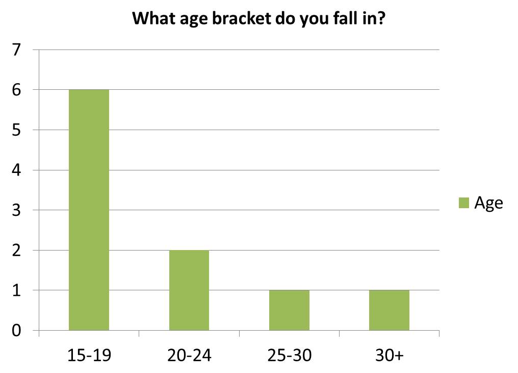
The majority of those that filled out the questionnaire were between the ages 15 and 19. Since it is a large majority, we have taken their preferences into consideration as they would be slightly different to the other age ranges.

There is a lot of different answers to this question and this allows us to see the other styles of movies that people like other than horrors. This information is useful because it shows what elements I could add to my trailer to make it more enjoyable for our target audience.

A large percentage of the people that were asked this question chose "Sinister" as their favourite horror movie. "Sinister" is a psychological horror movie and so I could use some elements from the movie such as sound effects and cuts that will make our target audience enjoy the film trailer more.

From these results, it clearly indicates the most influential element that makes someone want to watch a horror movie is the trailer. This means that my aim for our project is to create a good, strong, high quality trailer to the best of my ability and the other two ancillary texts to support it.
I also asked if anything, what makes a horror movie less appealing to you?
The following answers are;
Gallons of blood and gore
Excessive gore overtaking story-telling
Story-lines that don’t make sense
A poor storyline
Poor ratings and reviews
From the results of this question, I will adhere to the answer such as "Story-lines that don’t make sense" and "poor styline", and adjust the narrative to appease those answers. The aim is obviously to attract the target audience, so to create a narrative that doesn't take into account these factors would be destined to fail.

Hostel and The Possession were chosen equally with 4 votes each. From this joint vote, I can use conventions from both posters to attract the target audience.

From the results shown, you can see that the people thought the most effective feature in a movie trailer is the sound track. This shows me that I should add and focus on the soundtrack as the important element of my trailer as it will draw in the target audience.
Subscribe to:
Posts (Atom)